You’ve seen it countless times – that iconic apple with a bite taken out of it. But why the bite? What’s the story behind apple logo that has survived as a symbol of technology and innovation? Let’s dive deep and discover the fascinating truth behind the Apple logo.
Ideal Symbolism
Think of the Apple logo; you can’t help but think of sleek gadgets, new technology, and endless innovative possibilities. It’s more than just a logo; it symbolizes creativity, innovation, and the relentless pursuit of excellence. But have you ever thought about how it came to be this popular?
Over the years, rumors have circulated about the hidden meaning behind the bite in the Apple logo. Some say it’s a clever play on words, a nod to the computing term “byte.” Others suggest it references the biblical story of Adam and Eve. But the truth is far simpler – and more fascinating – than fiction.
Story Behind Apple Logo
In the early days of Apple, co-founder Steve Jobs knew that a strong logo was essential for building brand identity. He wanted something simple yet memorable that would instantly convey the company’s essence to consumers. And so, he turned to graphic designer Rob Janoff to bring his vision to life.
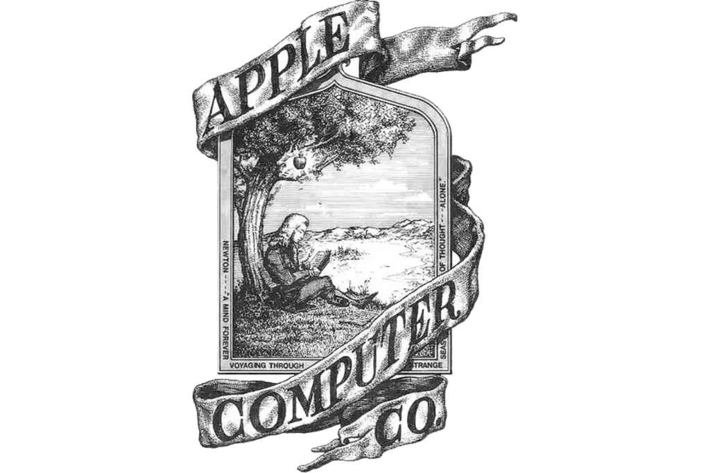
Janoff faced the challenge of creating a logo that captured the essence of Apple without being overly complex for the customers or stakeholders. His initial designs featured Sir Isaac Newton sitting beneath an apple tree, a tribute to the iconic tale of discovery. However, this idea seemed too complex as Jobs wanted something more modern and streamlined.

When Janoff presented his first look at the logo – a simple apple shape – there was a problem. Without context, many people mistook it for a cherry or any other round fruit. Jobs knew they needed to change to ensure the logo was unmistakably recognized and symbolized Apple.
Why Is There A Bite In The Apple Logo?
The bite was taken out of the Apple logo to create some distinction for the brand. It wasn’t a deliberate nod to computing terminology or religious symbolism but a practical and clever solution to a design problem. The bite instantly transformed the apple into a recognizable symbol, setting it apart from any other fruit.
Read More: Apple Records 2.2 Billion Active Devices in Just Q1
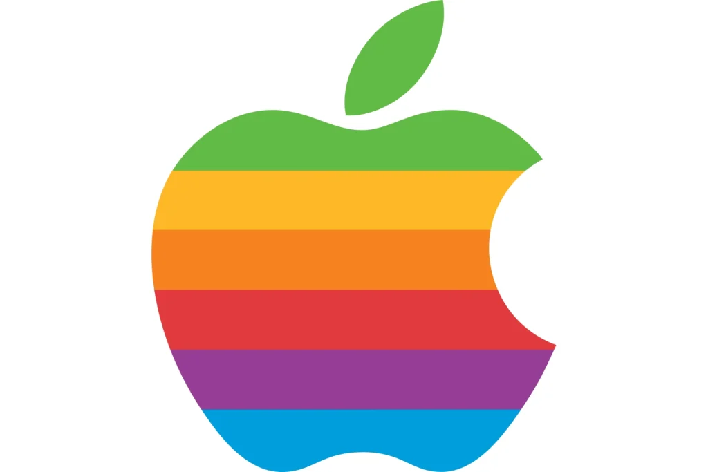
But Janoff didn’t stop there. He added colorful stripes to the apple, symbolizing the company’s groundbreaking ability to display color images at that time. This success set Apple apart from its competitors at an initial level. Despite the speculation surrounding the logo’s meaning, Janoff insists that the bite wasn’t intentional wordplay. It was simply a small detail that made a big impact, forever cementing the Apple logo in the journals of design history.

Today, the Apple logo remains one of the most recognizable symbols in the world. It’s a testament to the power of simplicity and ingenuity in design and a reminder that sometimes, the most enduring symbols are born out of necessity. So, the next time you see that familiar apple with a bite taken out of it, take a moment to appreciate the creative and innovative story behind apple logo. After all, it’s more than just a logo – it’s a symbol of many possibilities.


